Video: See 40 years of Bruce Springsteen tours as a heat map
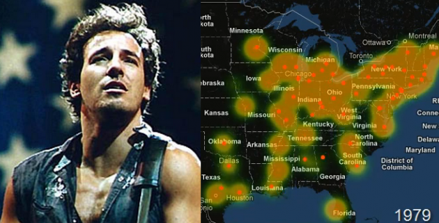 Check out this video that shows an album by album breakdown of the ‘heat’ generated by Bruce Springsteen’s tours. By Daniel Trone:
Animated heat map of Bruce Springsteen touring locations from 1973-2012. The heat effect is generated by a) the location of the show, b) the size of the venue, and c) the overall population within 40km of the show location (e.g. a single arena show in Omaha, NE generates more “heat” than a single arena show in New York City).
